デイトラweb制作中級編 DAY17
 nakano
テーブルとGoogleMap(iframe)埋め込みのコーディング

「Price」のコーディング

①HTML
section「.price」の全体

「price__table」の詳細

<section class="price section">
    <div class="price__inner inner">
        <div class="price__head section-title">Price</div>
        <div class="price__content">
            <div class="price__image"><img src="./img/price-img.png" alt=""></div>
            <div class="price__table">
                <table class="table">
                    <tr>
                        <th></th>
                        <th>column1</th>
                        <th>column2</th>
                    </tr>
                    <tr>
                        <th>row1</th>
                        <td>100円</td>
                        <td>100円</td>
                    </tr>
                    <tr>
                        <th>row2</th>
                        <td>6,000円</td>
                        <td>0円</td>
                    </tr>
                    <tr>
                        <th>row3</th>
                        <td><strong>6,000円</strong><span>※今だけ半額</span></td>
                        <td>0円</td>
                    </tr>
                    <tr>
                        <th>row4</th>
                        <td>100円</td>
                        <td>100円</td>
                    </tr>
                </table>
                <div class="price__attention">※目安なので詳しくは<a href="">お問い合わせ</a>ください。</div>
            </div>
        </div>
    </div>
</section>
「tr」「th」「td」のつけ方

tr ・・・ 列
th ・・・ 見出し
td ・・・ データ
②SCSS「.price」~「.price__attention」
.price {
    background: #efefef;
}

.price__content {
    display: flex;
    margin-top: 80px;

    @include mq('sp') {
        display: block;
        margin-top: 40px;
    }
}

.price__image {
    width: 454 / 1200 *100%;

    @include mq('sp') {
        width: 100%;
    }
}

.price__table {
    width: (172 + 268 + 268) / 1200 *100%;
    margin-left: auto;

    @include mq('sp') {
        width: 100%;
        margin-top: 24px;
    }
}

.price__attention {
    font-size: 14px;
        margin-top: 5px;

    a {
        font-weight: 700;
    }
}
Flexを使うときの注意点
親要素 → CSSで「flex」を使うなら
子要素 → 「div」で囲む
imgをそのまま子要素にした場合、画像が必要以上に高くなるなど表示の不具合が起こる
③SCSS「.table」
.table {
    border-collapse: collapse;
    border: 1px solid #707070;
    background: #fff;
    font-weight: 700;
    width: 100%;
    table-layout: fixed;

    th,
    td {
        border: 1px solid #707070;
        padding: 0 24px;
        height: 58px;
        vertical-align: middle;

    }

    th {
        background: #999999;
        color: #fff;
        text-align: center;

        &:nth-child(1) {
            width: 172px;

            @include mq('sp') {
                width: 95px;
            }
        }
    }

    td {
        text-align: right;
    }

    strong {
        color: #E81919;
        line-height: 1.2;
    }

    span {
        font-size: 13px;
        display: block;
        margin-top: 1px;
        line-height: 1.2;
    }
}
枠線(ボーダー)の表示
border-collapse: 値;
値の種類
separate → 初期値、隣接するセルのボーダーを、間を空けずに離して表示
collapse → 隣接するセルのボーダーを、間を空けずに重ねて表示

引用元:border-collapseプロパティの意味と使い方
table内の列の幅を均等にする
width: 100%
table-layout: fixed;
※特定の列だけwidthを指定すれば、その列のみ指定した幅になる
セルの中身を上下中央に配置
vertical-align: middle;
※インライン要素とテーブルセルにのみ適用できる
インライン要素・ブロック要素 → 中級編 DAY12
ほかにも
top(上端揃え)
middle(下端揃え) などがある
「Access」のコーディング
①HTML

「access__info」の詳細

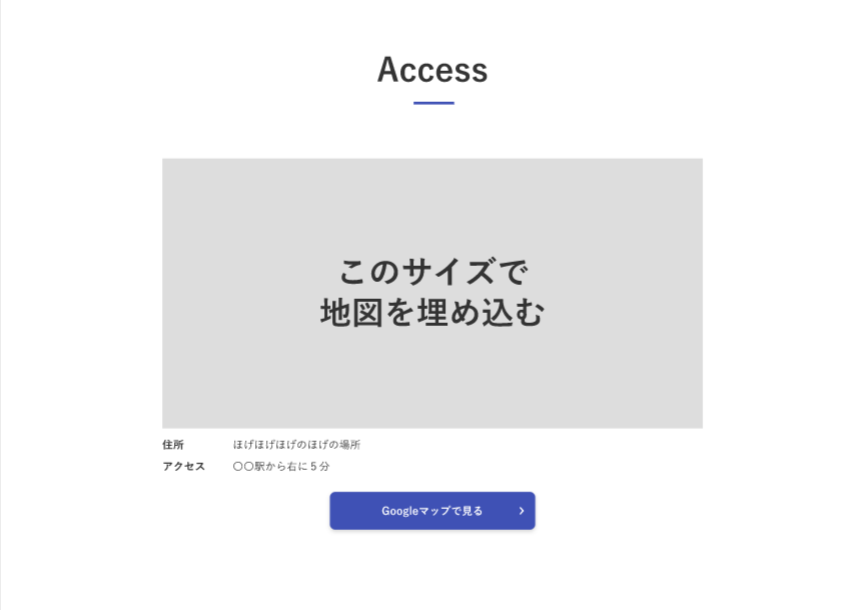
<section class="access section">
    <div class="access__inner inner">
        <div class="access__head section-title">Access</div>
        <div class="access__map">
            <div class="iframe-wrap">
                <iframe
                    src="https://www.google.com/maps/embed?pb=!1m18!1m12!1m3!1d3239.6566075689298!2d139.80851171436308!3d35.71006703599915!2m3!1f0!2f0!3f0!3m2!1i1024!2i768!4f13.1!3m3!1m2!1s0x60188ed0d12f9adf%3A0x7d1d4fb31f43f72a!2z5p2x5Lqs44K544Kr44Kk44OE44Oq44O8!5e0!3m2!1sja!2sjp!4v1653903749126!5m2!1sja!2sjp"
                    width="600" height="450" style="border:0;" allowfullscreen="" loading="lazy"
                    referrerpolicy="no-referrer-when-downgrade"></iframe>
            </div>
        </div>
        <dl class="access__info">
            <div class="access__info-row">
                <dt>住所</dt>
                <dd>ほげほげほげのほげの場所</dd>
            </div>
            <div class="access__info-row">
                <dt>アクセス</dt>
                <dd>〇〇駅から右に5分</dd>
            </div>
        </dl>
        <div class="access__button"><a href="">Googleマップで見る</a></div>
    </div>
</section>
②SCSS「.access」~「.access__info-row」
.access {

}

.access__map {
    margin: 80px auto 0;
    width: 800px;
    max-width: 100%;

    @include mq('sp') {
        margin-top: 40px;
    }
}

.iframe-wrap {
    width: 100%;
    padding-top: 400 / 800 * 100%;
    position: relative;

    iframe {
        position: absolute;
        top: 0;
        left: 0;
        width: 100%;
        height: 100%;
    }
}

.access__info {
    margin: 6px auto 0;
    width: 800px;
    max-width: 100%;
}

.access__info-row {
    display: flex;
    align-items: center;
    line-height: (27 / 16);

    &:not(:first-child) {
        margin-top: 8px;
    }

    dt {
        margin: 0;
        padding: 0;
        font-weight: 700;
        width: 104px;
    }

    dd {
        margin: 0;
        padding: 0;
        width: calc(100% - 104px);
    }
}
iframeの縦横比を保ったまま表示サイズを自在に変更する
.iframe-wrap {
    width: 100%;
    // デザインカンプの(縦 / 横)
    padding-top: 400 / 800 * 100%;
    position: relative;

    iframe {
        position: absolute;
        top: 0;
        left: 0;
        width: 100%;
        height: 100%;
    }
}div「.iframe-wrap」
・iframeを囲む
・widthと"position: relative;" をつける
・padding-topをつけ、縦横比を算出して指定する
iframe
・iframeに"position: absolute;"をつけて、"width: 100%;" と "height: 100%;" を付ける
dt・dd (+ dl)の使い方
dl(description list)= 説明リスト
dt(description term)= 説明する言葉
dd(definition / description)= 定義文 or 説明文
余計なmargin、paddingを消す
→ 「margin: 0;」と「padding: 0;」を設定
参考記参考記事
③SCSS「.access__button」
.access__button {
    text-align: center;
    margin-top: 25px;

    a {
        text-decoration: none;
        display: inline-block;
        width: 304px;
        text-align: center;
        color: #fff;
        font-weight: 700;
        padding: 15px 20px;
        border-radius: 8px;
        background: $color-main;
        box-shadow: 0 3px 6px rgba(#000, 0.16);
        position: relative;

        &::after {
            content: "";
            position: absolute;
            top: 50%;
            right: 12px;
            transform: translateY(-50%);
            width: 17px;
            height: 16px;
            background: url(../img/button-arrow.png) no-repeat center center / contain;
        }
    }
}
→ 中級編 DAY16 の「.news__more」ボタンとほとんど同じ作り方
まとめ
今回はテーブルとGoogleMap(iframe)埋め込みのコーディングをしました。
GoogleMapの埋め込みはなんとなく難しいだろうぁと始める前に思っていたのですが、予想よりも簡単で時間も手間も全然かからなかったです。
LP案件において、GoogleMapやYoutubeを埋め込む機会は多いみたいなので、絶対に押さえておきたいと思いました!