デイトラweb制作中級編 DAY25
 nakano
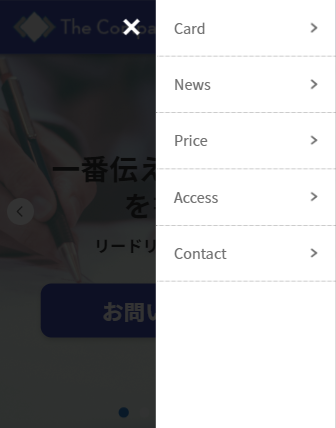
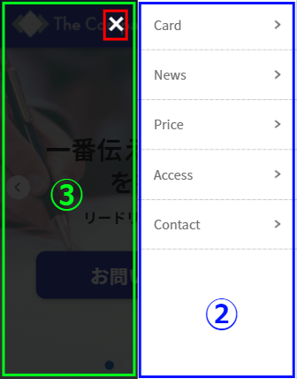
スマホ時のドロワーメニューを作る

HTML

HTMLは大きく分けて3つ
①.drawer-icon
→ 「≡」と「×」は切り替え
②.drawer-content
③.drawer-background
<div class="drawer-icon">
    <div class="drawer-icon__bars">
        <div class="drawer-icon__bar1"></div>
        <div class="drawer-icon__bar2"></div>
        <div class="drawer-icon__bar3"></div>
    </div>
</div>

<div class="drawer-content">
    <div class="drawer-content__items">
        <div class="drawer-content__item"><a href="">Card</a></div>
        <div class="drawer-content__item"><a href="">News</a></div>
        <div class="drawer-content__item"><a href="">Price</a></div>
        <div class="drawer-content__item"><a href="">Access</a></div>
        <div class="drawer-content__item"><a href="">Contact</a></div>
    </div>
</div>

<div class="drawer-background"></div>
・
・
・
<!-- 自分のファイルの上に配置 -->
<script src="https://ajax.googleapis.com/ajax/libs/jquery/3.6.0/jquery.min.js"></script>
<script src="https://unpkg.com/swiper@8/swiper-bundle.min.js"></script>
<script src="js/wow.min.js"></script>
<script src="js/script.js"></script>
jQuery公式サイト
→ https://jquery.com/download/
Google CDN の 3.x snippet: をコピー
①SCSS「drawer-icon」
「×」を作成
.drawer-icon {
    position: fixed;
    top: 20px;
    right: 16px;
    z-index: 300;
    display: none;
    // 中級編 DAY20
    transition: transform 0.5s ease 0s;

    @include mq('sp') {
        display: block;
    }

    &.is-active {
        // クリックで「×」を左に200px移動
        transform: translateX(-200px);

        .drawer-icon__bar1 {
            transform: rotate(-45deg);
            top:8px;
        }

        .drawer-icon__bar2 {
            display: none;
        }

        .drawer-icon__bar3 {
            transform: rotate(45deg);
            top: 8px;
        }
    }
}「≡」を作成
.drawer-icon__bars {
    width: 22px;
    height: 20px;
    display: block;
    position: relative;
}

.drawer-icon__bar1,
.drawer-icon__bar2,
.drawer-icon__bar3 {
    position: absolute;
    width: 22px;
    height: 4px;
    background: #fff;
    top: 0;
    left: 0;
}

.drawer-icon__bar1 {
    top: 0;
}

.drawer-icon__bar2 {
    top: 8px;
}

.drawer-icon__bar3 {
    top: 16px;
}
ここで行ったこと
1. 最初に「≡」を作成する
2. 作成した「≡」の形を変えて「×」を作成
3. 「.is-active」をon,offで切り替え
→ 設定はjQueryで
②SCSS「drawer-content」
.drawer-content {
    width: 200px;
    height: 100%;
    position: fixed;
    right: 0;
    top: 0;
    background: #fff;
    box-shadow: 0 0 3px rgba(#000, 0.16);
    z-index: 299;
    transform: translateX(105%);
    // 「.is-active」内の「transform」を指定
    transition: transform 0.5s ease 0s;

    &.is-active {
        transform: translateX(0);
    }
}
枠線とアローアイコンの設定
.drawer-content__item {
    border-bottom: 1px dotted #707070;

    a {
        display: block;
        color: #707070;
        text-decoration: none;
        // 20px - (border 1px*2) = 18px
        padding: 18px 20px;
        position: relative;

        &::after {
            content: "";
            position: absolute;
            right: 20px;
            top: 50%;
            transform: translateY(-50%);
            width: 8px;
            height: 11px;
            background: url(../img/arrow-b.png) no-repeat center center / contain;
        }
    }
}
画面の外に出しておく
transform: translateX(105%);
→ 「.is-active」時に transform: translateX(0);
※100%でも良いが念のため105%
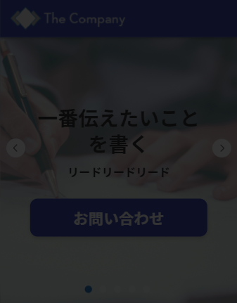
イメージ画像

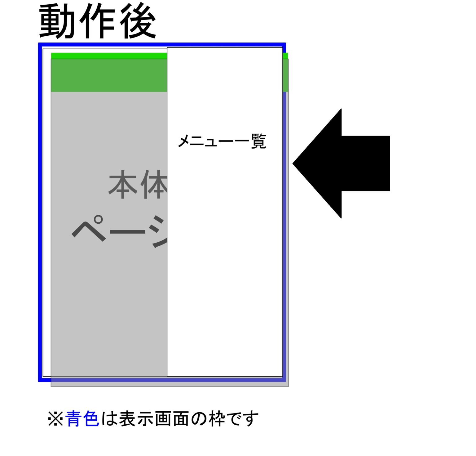
引用元:ドロワーメニューの仕組みを理解するために、コードを徹底解剖してみた
③SCSS「drawer-background」
.drawer-background {
    position: fixed;
    top: 0;
    left: 0;
    width: 100%;
    height: 100%;
    background: rgba(#000, 0.8);
    z-index: 298;
    display: none;

    &.is-active {
        display: block;
    }
}
画面全体を半透明な黒で覆う
→ 「z-index」で重なる順番を決める!
ドロワーメニューを開いた時のレイヤー階層
z-indexの数値
1. 通常のbody内のコンテンツ
→ auto(0)
2. ヘッダー
→ 100
3. ドロワー開いた時の黒背景
→ 298
4. ドロワーメニュー
→ 299
5. 「≡」「×」
→ 300
※z-index の初期値は「auto」で親要素と自動で同じ階層になる
(ここが基準の 0)
jQuery
jQuery('.drawer-icon').on('click', function(e) {
    e.preventDefault();

    jQuery('.drawer-icon').toggleClass('is-active');
    jQuery('.drawer-content').toggleClass('is-active');
    jQuery('.drawer-background').toggleClass('is-active');

    return false;
});
ここで行っていること
・aタグ特有のページ遷移を無効化
→ 「.drawer-icon」のみ
・クリック時に「.is-active」を付与
jQuery(" 無効にする対象 ").on("click", function(e) {
	e.preventDefault();
	//ここにドロワーの記述
	return false;
});
クリックイベント時に e.preventDefault(); と return false; が頻出
ドロワーが作れるライブラリ
まとめ
今回はスマホ時のドロワーメニューを作りました。
中級編 DAY5 のドロワーメニューとは違って、全体を覆うようなものだったので前よりも作るのに時間がかかりました。
ドロワーメニューができた後のサイトを見ると、だいぶ完成が近いように感じます。
デザインは近づいても機能がまだだと思うので、引き続きデザインカンプからのコーディングを頑張りたいです!

